Tuesday, 15 November 2011


Two different colour-ways used in a seamless pattern for Caitlyns wallpaper design. Was originally planning on doing a dada style wallpaper, but that fell through when I realised how difficult that'd actually be to do in the time we were given.

I sort of made this with minimalism in mind and ended up sticking with it. I was told that some of my designs (that I posted earlier) would've been good to use, but they were just so difficult to work with. 

P.S. The quality is fucking shocking, didn't even realise, wow.


The book spread, almost finished. Couldn't be bothered editing the last post, haha. I'm pretty happy with how this is looking, although I'm struggling to put together a workable colour for the book-flaps so I might just extend the map further, or place in a similar texture.


The black isn't permanent by any means. I was playing around with the opacity beforehand because I was pretty content on using a black (or shade), but it's just far too strong.


A couple of website mockups that I pulled together today. The brief was along the lines of creating an easily accessible, relaxing website environment. Pretty obvious the first image doesn't really give off that vibe, so I did a complete turnaround (thanks to Fiona) and started playing around with textural images, pulling in random images to play around with the colour palette, manipulated gradients and feathers and achieved a relatively good Web 2.0 feel. 


We were given a brief to create an a5 document dedicated to GrainTech, as well as developing a relatable logo. Pretty happy with the results!

The pages are ordered in from front-to-back, so the two top images are the front/back-cover, pretty straightforward haha.


We were given a brief to basically create an eye-catching advertisement for the City of Yarra and to inform about pests / animals.

This isn't the final copy, so there's a lot of overset text / missing and broken segments etc.

Friday, 11 November 2011


Front / Backcover Redesign and a Bookmark redesign all for The Hobbit. We were given a brief to redesign a classic novel, and it was only natural for me to choose to do this, simply because I grew up reading this and the Lord of the Rings books. Bilbo's sort of a blend between his traditional self and Buffalo Bill (predominately him), although I think it works really well.

The spine will come eventually, and I'll have to photograph it with a white background for that professional feel, haha.

P.S. Still needs work on the text, it's barely legible at the moment.


A selection of base designs I'm thinking of working with for my wallpaper. I'm basically set on working with the fourth design down (from the top), manipulating the little intricate areas of the circle and playing around with colours.


Two frames I was particularly proud of designing within the animation about a month back. I'll get around to uploading that eventually (and the new one I'm working on).


We were asked to design either a jack, queen or king earlier in the year, so I decided to go with a king of clubs, incredibly happy with the results. Inspired by Larry King ;)


A selection of Jazz / Food CD Covers that I designed much earlier this year. I'm actually missing a couple of other samples that I made, so I'll try and get around to finding those eventually. The first image has taken a large deal of inspiration from a particular image, here:

AG Ideas.


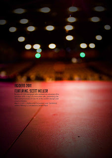
A poster for AG Ideas that I put together earlier in the year.